What is UX Writing?
UX writing is the practice of writing the words inside a digital product: buttons, menus, form labels, error messages, and empty states. Good UX writing helps someone finish a task without confusion or a support ticket, and it ships as part of the interface rather than a document added later.


Table of contents
Open any app on your phone and read it closely. The button you tap, the label on the field, the message when something breaks: someone wrote every word. That writing is UX writing. When it is good, you move through the product and barely notice the text. When it is bad, you hesitate, blame yourself, and sometimes leave.
Where UX writing shows up
UX writing lives in the small, functional text spread throughout a product. You will find it in:
Buttons and links (Save changes, Cancel, Upgrade)
Menu and navigation labels
Onboarding and setup steps
Form fields, hints, and validation
Error messages
Empty states, before a user has any data
Confirmations and success messages
Tooltips and inline help
Add it up and a large share of any product is UX writing. Most of it is short, and all of it shapes whether a person feels capable or stuck. In SaaS products, digital adoption platforms can place that copy in tooltips and onboarding flows, then show where users still need help.
UX writing vs copywriting
The two crafts overlap, and the difference is the reader's mindset. Copywriting reaches someone who is deciding whether to trust you. UX writing reaches someone who has already committed and is trying to get something done.
| Copywriting | UX writing | |
|---|---|---|
| Its job | Persuade you to choose and act | Guide you through a task |
| Reader's mindset | Deciding whether to trust | Trying to finish something |
| Where it lives | Marketing pages, ads, emails | Inside the product |
| Success looks like | A conversion | A completed task |
Most products need both, and they read best when one team writes them together.

Want product copy your users can follow?
We write the UX copy and build it into the interface, on the same team.
Why UX writing matters
Clear product text is a business lever. Confusing microcopy sends people to support or out the door, and both cost you. A single reworded error message can cut the tickets coming from that one flow. A clearer onboarding step can lift the number of users who reach the moment your product proves its worth. And when something goes wrong, calm and specific words are what hold a user's trust instead of losing it.
None of this needs a big rewrite. UX writing earns its keep in small, precise edits to the screens people already use.
UX writing best practices
Clear over clever
Someone reading a label is mid-task. Skip the wit and say what the button does. "Delete account" beats "Say goodbye" when a user wants to leave.
Lead with the user's goal
Name the action from the user's side. "Save changes" tells them what happens next. "Submit" makes them guess.
Stay consistent
Use one word per concept and one voice across the product. If it is a "workspace" on one screen, keep it a workspace on the next, never a "project". A style guide keeps this honest as the product and the team grow.
Write for the moment
Match the words to the user's state. An error stays calm and offers the fix. An empty state points to the first useful action instead of showing a blank shrug.
Cut words
Space is tight and attention is tighter. Read every label and remove the words a user would not miss.
Test with real users
Watch people move through the flow. Where they pause or reread is where the words need work.
UX writing examples
The change is usually small. Three before-and-after edits:
A button that describes the system, rewritten to describe the outcome:
Before
Submit
After
Create account
An error that blames the user, rewritten to help them:
Before
Error: invalid input.
After
That email is missing an "@". Check it and try again.
An empty state that dead-ends, rewritten to move the user forward:
Before
No items
After
No invoices yet. Create your first one to get paid.
A quick test for any label: read it as if you are tired and in a hurry. If it tells you what just happened and what to do next, it is doing its job.
Eurobank
Finance
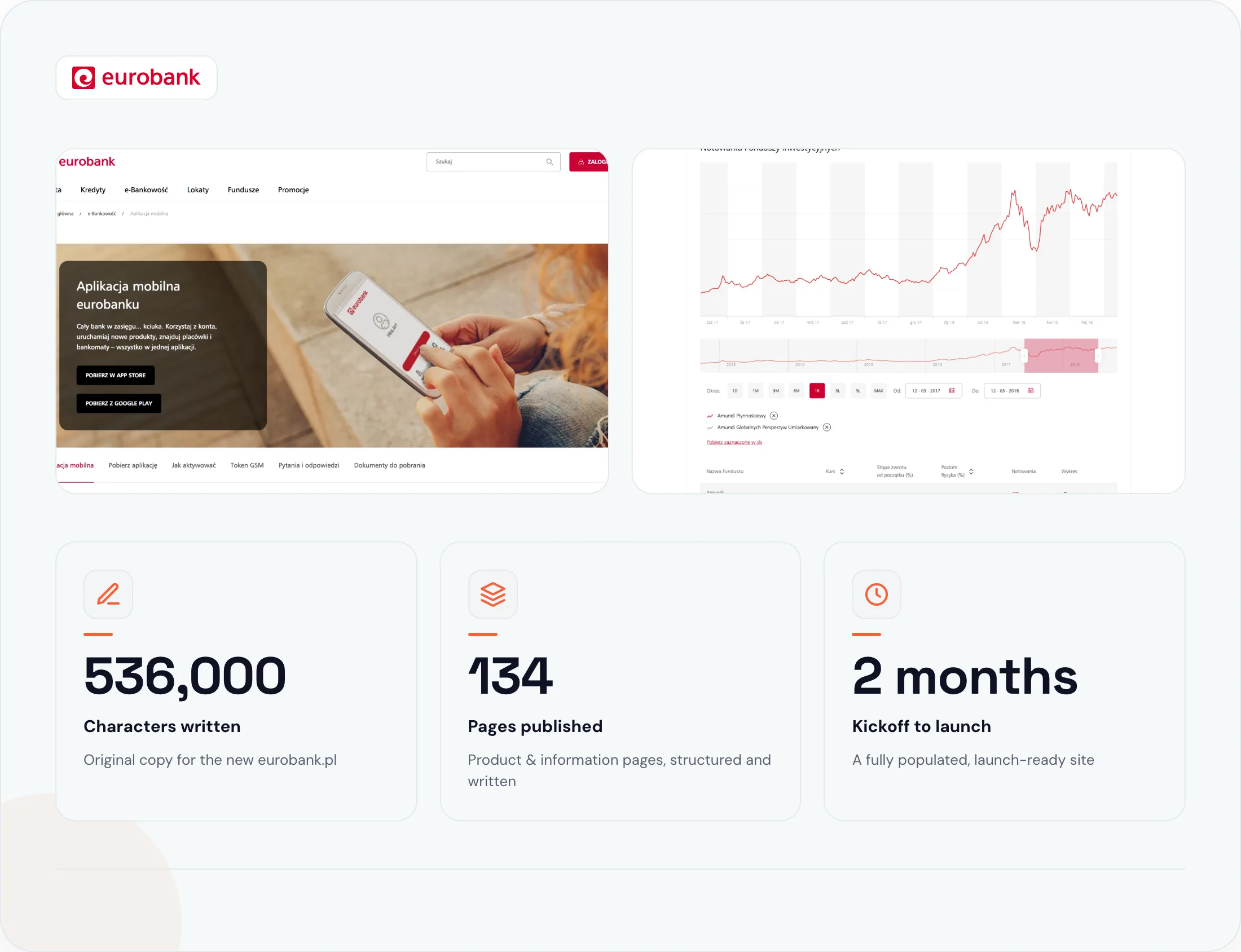
Naturaily wrote and published the copy for eurobank's entire new website: 134 product and information pages, structured for SEO and loaded straight into the client's CMS. The whole build shipped in two months, ready to go live the day the site launched.
1 voice
Across all 134 pages
450 hours
Total project time
SEO-ready
Every page, before launch
How UX writing fits into the build
UX writing works best when it is written inside the interface. Words reviewed in a spreadsheet read differently once they sit on a real button, at a real width, inside a real flow. A label that looked fine in a doc can overflow, clash with the one beside it, or answer the wrong question in context.
The tightest results come when the people writing the microcopy also see it in the build. That is how we run UX writing services at Naturaily. The copy ships are wired into the components, next to the developers who build them, so the words you approve are the words your users read.
FAQ
Questions about UX writing
Copywriting persuades someone to choose you and act. UX writing guides someone through a task inside a product, using microcopy like buttons, labels, and error messages. Most products need both.
Microcopy is the small text UX writing produces: button labels, hints, errors, and empty states. UX writing is the wider practice, and microcopy is its most visible output.
Plain-language writing, an eye for user flows, empathy for the moment a user is in, and comfort working inside design tools alongside designers and developers.
AI can research and draft, but a person should shape the argument and edit the copy. AI-only copy tends to read as filler, and without a human in the loop, it might rank poorly.
Naturaily is a copywriting and web-development agency. We write UX copy and conversion copy, then ship it inside fast, headless builds on Next.js, Storyblok, Sanity, and Payload.
Product text that gets people through the task
Tell us the flow that is losing users. We reply with an approach, scope, and a fixed estimate inside a week.
Naturaily is a copywriting and web-development agency. We write UX copy and conversion copy, then ship it inside fast, headless builds on Next.js, Storyblok, Sanity, and Payload.