Microcopy: Examples and Best Practices
Microcopy is the small, functional text in a digital product: button labels, form hints, error messages, empty states, and confirmations. A good microcopy tells a user what just happened and what to do next, in as few words as possible, so they can finish the task without stopping to think.


Table of contents
You have felt microcopy work, even if you never noticed the words: the button that told you what would happen when you clicked it, the error that pointed at the one field you missed, or the empty screen that showed you where to start. Microcopy is the quiet layer of text that carries people through a product, and small edits to it move real numbers.
What is microcopy?
Microcopy is the small text attached to a single action or moment in an interface: a button, a field label, a hint, an error, a success message, an empty state. It sits inside the wider practice of what UX writing is, which covers all the text in a product. Microcopy is the part users read most and notice least.
Why microcopy matters
Microcopy appears at the exact moment a user decides to continue or give up. A vague button raises doubt right before a click. A blaming error sends someone to support or away. A clear line at a checkout or a permission prompt is often the difference between a finished task and an abandoned one.
Because it sits on the path to the goal, a few reworded lines can shift conversion, cut support tickets, and steady trust. None of it needs a redesign. Microcopy earns its keep in precise edits to screens people already use.

Fixing microcopy across a whole product?
We rewrite the small text and ship it inside the build, on one team. See how we work.
Microcopy best practices
Say what happens next
Write the label from the result the user gets. "Send invoice" names the outcome. "Submit" asks them to trust and guess.
Use the user's words
Match the language people already use for the task. If your users say "team", keep it a team on the button, never an "organization".
Keep it short
Read every line and cut the words a user would not miss. On a button, one strong verb usually wins.
Stay consistent
Pick one term per concept and one voice, then hold them across every screen. A shared style guide keeps this from drifting as the product grows.
Lower anxiety at risky moments
Deletes, payments, and permissions deserve calm, exact words. Say what will happen, what it affects, and how to undo it where they can.
Turn dead ends into next steps
An empty state or an error should point somewhere useful. Give the user the single next action instead of a shrug.
Eurobank
Finance
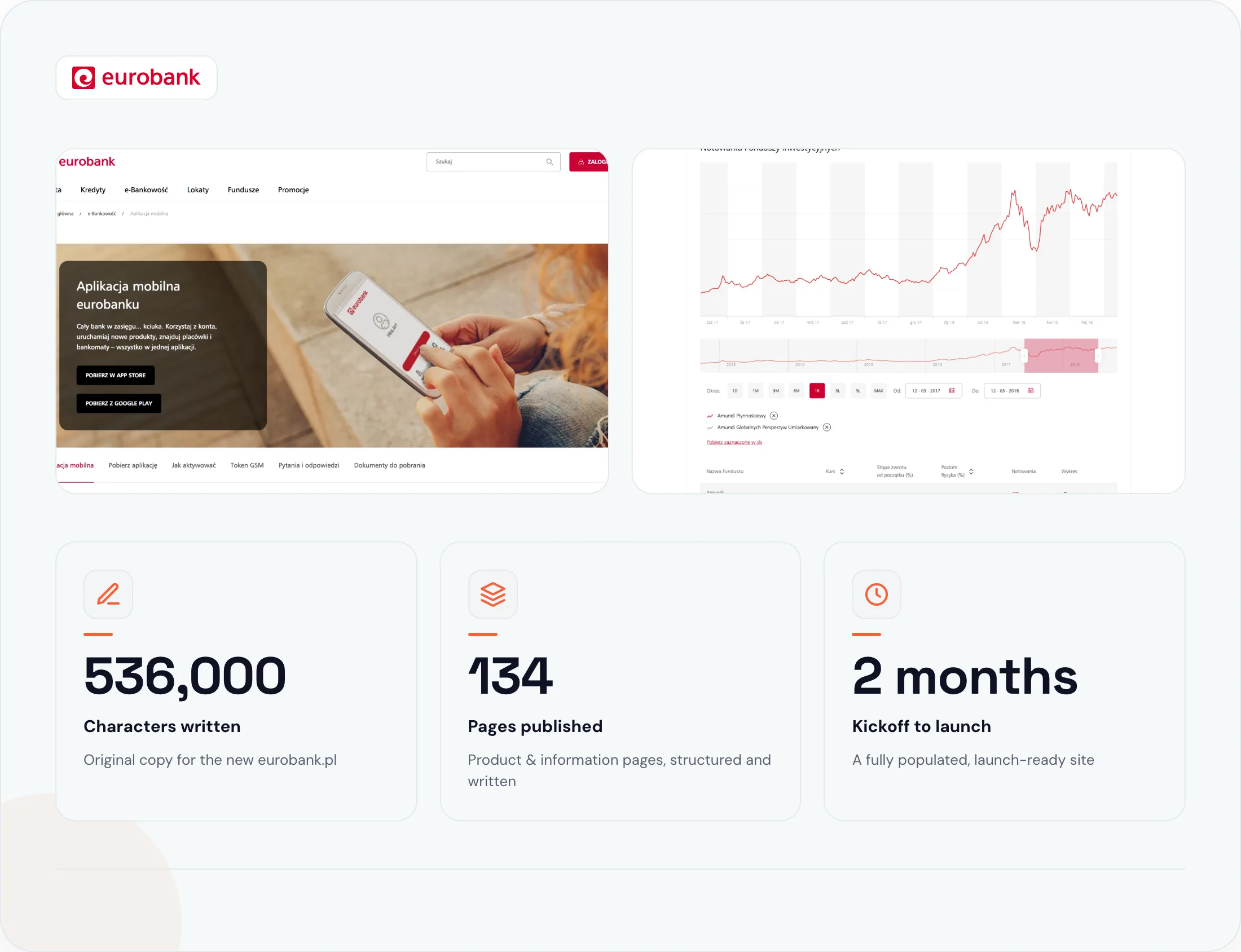
Naturaily wrote and published the copy for eurobank's entire new website: 134 product and information pages, structured for SEO and loaded straight into the client's CMS. The whole build shipped in two months, ready to go live the day the site launched.
1 voice
Across all 134 pages
450 hours
Total project time
SEO-ready
Every page, before launch
Microcopy examples by type
The fixes are small and specific. Here is one for each surface, with the reason it works.
Buttons
Before
Submit
After
Create account
Why it works: the label names the outcome, so the user knows what the click does before they make it.
Form fields and hints
Before
Phone
After
Phone (for delivery updates only)
Why it works: a short hint explains why you are asking, which lifts completion and lowers suspicion.
Error messages
Before
Error: invalid input.
After
That email is missing an "@". Check it and try again.
Why it works: it names the problem, points to the fix, and drops the blame.
Empty states
Before
No data.
After
No invoices yet. Create your first one to get paid.
Why it works: it sets the expectation and hands the user the next action.
Confirmations and success messages
Before
Success!
After
Invoice sent to Anna. We'll email you when she opens it.
Why it works: it confirms the exact thing that happened and sets up what comes next.
Permission and paywall moments
Before
Allow notifications?
After
Get notified when a client pays. Turn this off anytime.
Why it works: it trades a vague ask for a concrete benefit and lowers the risk of saying yes.
Common microcopy mistakes
System-speak on buttons ("Submit", "OK") that hides what the click does.
Errors that blame the user or show a code no one can read.
Jargon the user would never say out loud.
Inconsistent terms: the same thing called three names across three screens.
Empty states that dead-end and give no next step.
Walls of helper text that bury the one line that matters.
A fast review for any screen: read each line as if you are tired and rushing. If it tells you what happened and what to do next, keep it. If it does not, rewrite it.
How to write microcopy that ships
Microcopy reads differently on a real button than in a spreadsheet. A label that fit in a doc can overflow, sit awkwardly beside its neighbor, or answer the wrong question once it lands in the flow. The reliable way to get it right is to write and review it in the interface, at the real width, in the real sequence.
That is how we run UX writing services at Naturaily. The microcopy ships are wired into the components, next to the developers who build them, so the words you approved reach your users unchanged.
FAQ
Questions about microcopy
Microcopy is the small text itself, like buttons and error messages. UX writing is the wider practice of writing all the text inside a product. Microcopy is the most visible output of UX writing.
A good microcopy is clear, short, and written for the user's moment. It says what happened and what to do next, uses the user's words, and stays consistent across the product.
On buttons, form fields and hints, error and success messages, empty states, tooltips, onboarding steps, and permission or paywall screens.
A UX writer or content designer, often with the product designer and developer. On smaller teams a copywriter or designer owns it until the product needs a specialist.
Naturaily is a copywriting and web-development agency. We write UX copy and conversion copy, then ship it inside fast, headless builds on Next.js, Storyblok, Sanity, and Payload.
Microcopy that helps people understand the task
Tell us the screen or flow that is losing users. We reply with an approach, scope, and a fixed estimate.
Naturaily is a copywriting and web-development agency. We write UX copy and conversion copy, then ship it inside fast, headless builds on Next.js, Storyblok, Sanity, and Payload.