Android developer guidance on showing help screens
There are only a few things more deadly for apps than a situation when the user doesn’t know what to do. We’ve all been there, turning on some program, registering, logging in and… what now? Just some blank screen, a lot of buttons, twenty tabs, thirty windows… Mom! let me out! Close, delete, forget.


There are only a few things more deadly for apps than a situation when the user doesn’t know what to do. We’ve all been there, turning on some program, registering, logging in and… what now? Just some blank screen, a lot of buttons, twenty tabs, thirty windows... Mom! let me out! Close, delete, forget.
OWN - Okay, what now?
Appreciate the insight of someone with expertise: the main reason why this problem occurs is because developers know their apps very well, and do most of the things related to them (especially testing) automatically, without thinking much. “Okay let’s login, swipe right, press this, great, dialog window shows up”, while user gets blocked on second step. Btw. this is the main reason why a developer should never test their own code.
No matter the reasons, there’ve been a few attempts to resolve the problem.
First of them were just as effective as popular Polish commentator, Jacek Gmoch’s ramblings about a football game. To cut the long story short: trying to show users everything in the app never turns out well. As a user, I rarely have so much time to download and learn an app as I would learning for my final exams or driving license. Getting in-app “tutorials” right requires even more testing, and may involve hiring additional people who can design such screens so that the user can actually understand them. If you have ever seen a developer struggle when speaking to a regular human being about a project he is working on, just try to imagine how it would go when he could use only arrows and text.
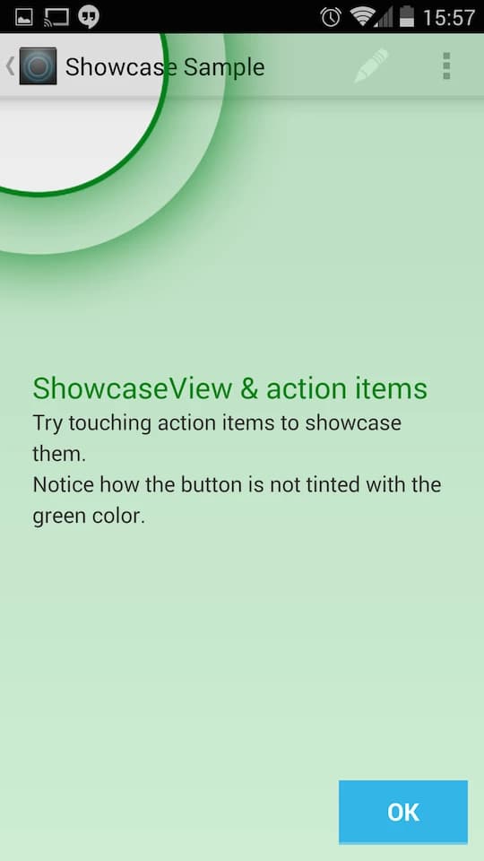
Another idea, somehow better, is a minimalist one. Showcase approach is similar to “arrow pointers” but there is one important difference: it neatly obscures every minor screen element which is not relevant at the time. This is done by making particular elements grey, more transparent, or even hiding them completely.
Thanks to that, user's attention is fully focused on the important features. It requires implementation of one more thing — self explanatory UI elements. The showcase method focuses on showing things to users by following the regular “flow” of application, reducing the need for lengthy descriptions. Additionally, covering the background in solid colour leaves more space for longer texts. Some good examples of library you can use are ShowcaseView and Android Cling.
Remember that most users are not interested in book-like help screens, and seeing something longer than 2 sentences makes them immediately click next, which results in an OWN problem again. And that leads us to my favourite solution…
How about we make everything work and look almost the same? Learn one, know them all — Material Design. With Lollipop, Google provided an answer for most of the problems described above. They took what was best in design of Apple products, simplicity and self explanatory, and used it as design language for their own products (Gmail, Google Maps, YouTube app, Hangouts).
The rules were really straightforward: hide menus in the navigation drawer, make more room for content presented to user. Instead of pummeling the user with numerous screens insisting to teach you how to interact with the app, just make a single floating action button that screams “Click me!”. And click they will.
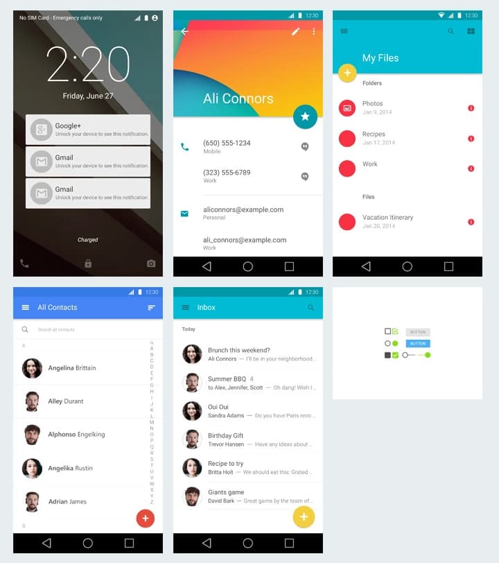
I like it, I love it, I use it. And most of big android players are taking from it too. For example: Twitter with its floating “What’s going on?” button, Endomondo and Microsoft health with navigation drawers or Evernote in its entirety.
Still, it may not be enough. Android 6.0 Marshmallow lets users decide what permissions to give each app. While most of us are happy to have control over which software can access what hardware, casual users are terrified because their phone is asking them something they do not necessarily understand.
Material Design is based on adaptation, which means that every app is easier to use if you have already used something similar before. It doesn’t work too well with completely new things, nor out-of-the-box solutions. Then, best practice is to add showcase in addition to material design. It can show the user what possibilities your app gives that normally are not included in other apps which will gently guide them by showing what to look for.
Most solutions use showcase as presentation of app possibilities and finally ask for permissions. It's like showing what you get if you agree to what we need (your contacts access or storage access). It's pretty neat, to be honest.
Conclusion
In sum, the ultimate answer always lies in the middle and it’s best to rely on your users. This shows the importance of gathering data and being up to speed on UX and development practices.
Let’s Create a Great Website Together
We'll shape your web platform the way you win it!
More posts in this category

January 17, 2022 • 16 min read
READ MOREIs Seville a Good Place for a Workation?
One of the members of our crew who decided to work from another place is Beata Twardowska. Some time ago, Beata returned from a month-long workation in Seville, Spain, and she decided to share her experiences with us.

December 03, 2021 • 6 min read
READ MORENaturaily Honored with Clutch Global Awards 2021!
Naturaily has received a 2021 Clutch Global Award! We have been honored as one of the Top 1000 Service Providers in the world.

November 04, 2021 • 6 min read
READ MORE4 Years of Freedom: Interview with Backend Dev K. Karpiński
At Naturaily, employees who have been with us for more than 3 years constitute 40% of the whole crew! One of them is Karol Karpinski, on board for 4 years. Karol started working at Naturaily in October 2017, and we asked him about his impressions so far.