Shopify Website Design: Examples, UX Tips & Navigation Best Practices
A Shopify store has only a few seconds to make the next step obvious. Shoppers need to understand what you sell, find the right product, trust the page, and move toward checkout without friction. That is where design, UX, navigation, product pages, mobile performance, and checkout flow start affecting revenue. This article walks through practical Shopify website design examples, UX tips, and navigation best practices that help customers browse faster, compare products more easily, and buy with fewer doubts.


According to many studies, the average conversion rate of e-commerce websites is about 3% – so how can we make this skyrocket? The right design of your online store can provide a lot of help – in fact, besides the product and the sales process itself, it is one of the crucial factors separating the average from the best. One of the most handy, accessible, and easy-to-use online tools offering shopping experiences is the Shopify platform, serving 1.75 million businesses worldwide and growing – ranging from small family companies to multinational chains.
In this article:
We will guide you through the process of creating a beautiful, functional, and user-friendly Shopify store that truly converts.
We will highlight tips and examples of websites for all the important steps – from the user’s first visit to the checkout.
We will also discuss the general benefits of using the Shopify platform and tell you how to prepare for the launch of your own online store.
Navigating Shopify Website Design: Strategies and Directions
When implementing a Shopify store, you can choose various options:
Opt for one of the ready-to-use, professional yet affordable templates
Get a custom-made layout by talented Shopify designers and developers
Or take full control by creating an own unique website design, using the tools provided
You may also cooperate with an external partner – a software house or a performance marketing agency – that will design and implement the shop for you.
Whichever option you pick, it’s vital to know the best practices of effective Shopify web design that rest not only on amazing looks, but also revolve around the guiding principles of user experience.
Capturing User Attention: Essential Elements of Shopify UX Design
The first goal at any Shopify website is to catch the user's eye and draw their attention. The shop, as one of your key sales channels, should look both professional and appealing. The Shopify platform offers many options for customizing store designs – not just the ability to choose colors and fonts, but also the organization of website elements in any desired and creative way.
See how we create Shopify themes that empower you to grow
Learn more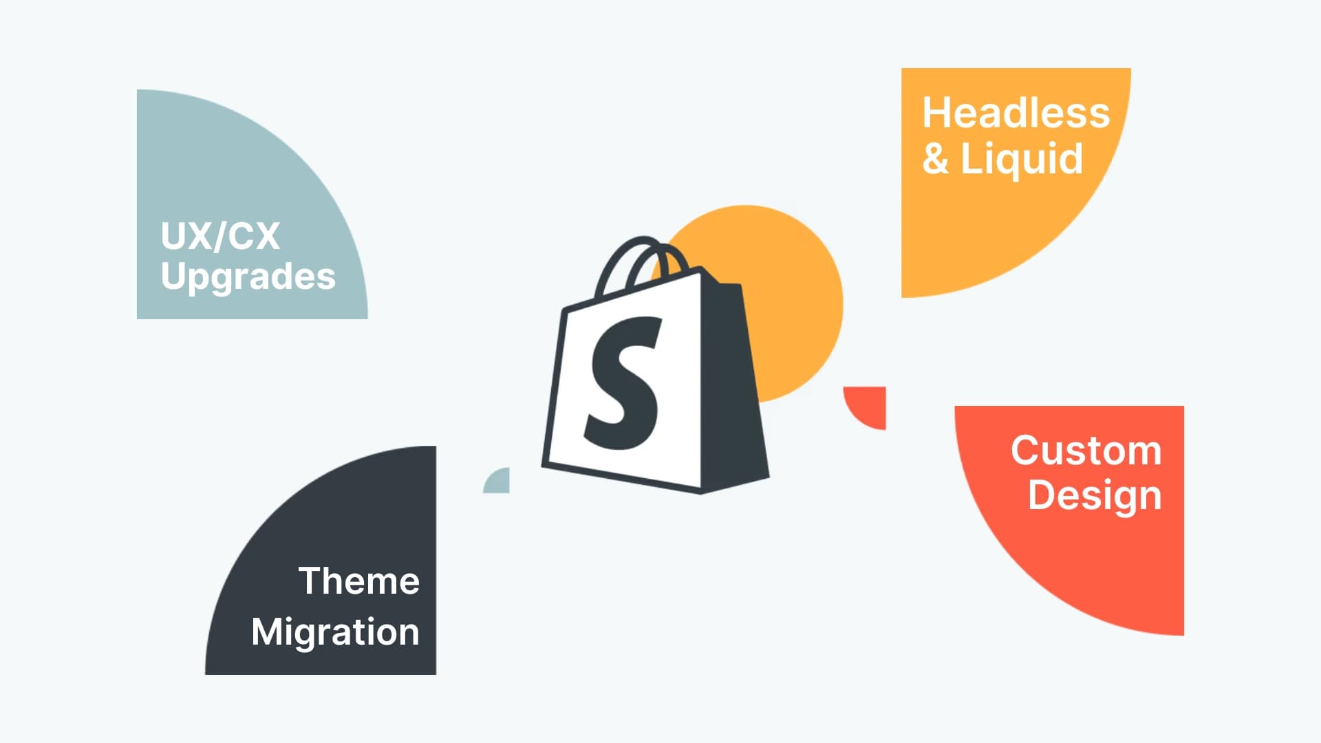
The role of color in Shopify UX design
Good advice would be to stick to your brand colors in the first place as, this way, you can build and strengthen your brand awareness, but you should remember to keep it simple – one main specific color, one to highlight the chosen elements and maybe two much more neutrals to complete the picture. A good example is the Amazon online store, which uses black, white and navy as the basics and orange in accents – it keeps the website simple and clear, which is a challenge with so many products.
The impact of headers on Shopify user experience
Another good idea is to add a striking header that will catch the eye’s attention. You can use bold and catchy images on the homepage, paired with a slogan and a value proposition – a one-sentence description of the store’s offer and competitive edge. It should be completed with a convincing call to action (CTA) button. Marlow, a shop selling pillows, makes it very clear – just one product image and a catchy slogan paired with a CTA.

A recommended practice is to use a video, which enables the visitor to immerse themselves in the brand’s world and take a sneak peek of the things it has to offer, which further builds trust. A company that shows their products in a beautiful and tasty way in their shop is the Danish brand Senndaia – on the website, you can see a video, a striking image, and a close-up of the product that makes you literally want to touch it.

Importance of product Recommendations in Shopify UX
Remember that many users may have visited your shop by pure chance or after seeing an ad somewhere – you need to convince these people to stay and take a further look. Information about best-selling, new or recommended products, as well as sales offers and special discounts should also all be easily visible on your homepage.
The Shopify platform provides a lot of options to display information in creative ways, like parallax themes, tiles, sliders, or image carrousels. American optician brand Visionist shows chosen glasses on a highly visible horizontal bar, where you can click the chosen one to be transferred to the product website.

Pop-ups vs UX - how to implement them in the right way?
This is a solution used to promote special offers that may be limited or seasonal in time. They will immediately draw the user’s attention, but it is important not to display too many of them, as it may irritate the prospective buyer. And if the user has suddenly decided to exit the shop without buying anything, you can also use a pop-up that will stop them, containing an extra offer, for instance.
The Power of a Well-Crafted Blog
It’s also worth enhancing the store’s impact with content marketing, taking advantage of the blog functionality and the ability to embed products into posts. Pipers Farm, a British food company, shows beautifully illustrated seasonal recipes that contain products, accompanied with mouth-watering images – who could resist?

Understanding Visual Hierarchy
Whatever catches the eye will do the job, but you should also not forget about the visual hierarchy of information. The most important things should be bigger and highlighted with color, but you should also stick to the golden rule of simplicity and not force the user to receive more information than they are able to digest, especially on the homepage.
Shopify UX: How to guide your customers to the right product?
To enable a customer to find and choose the right product is the main task of every online store. The Shopify platform gives a whole range of opportunities in this area. We shouldn’t forget that there are different categories of clients and each one comes to the shop with a different picture in mind and is placed at a different stage of the sales funnel.
There may be customers who come with very specific expectations or are looking for one specific product and, for these, we need search options and advanced filtering. Similarly, there are those who just want to shop around and would make good use of clearly divided product categories and special offers.

Making the most of search functions
Shopify has a bunch of options when it comes to the search functionality, and here are some good practices to be found. First, you should never hide the search box – it should be visible, easy to find (the best place is the top right corner or top center of the page) and always available from the homepage level. It’s good to show the entire input box and not only the clickable icon. You should also refine the search by choosing the autocomplete and autocorrect options, enhancing the speed and accuracy of the process, and similarly, you should describe the products in the store so that they contain a lot of relevant keywords.
You can also encourage prospective customers to search by adding a simple line in the box or just above it – such as “What are you looking for?” - like the clothing brand Patagonia, for example. The search option can also be useful for keeping in touch with users after they visit the shop – if they haven’t bought what they were searching for, we follow-up by an email asking them about it, offering a discount or suggesting other similar products.

Organizing Product Categories Effectively
As for products categories, they are very useful for people who generally know what they are looking for – like a jacket, a notebook, or a lipstick – but should be kept simple and intuitive. You should know your customers’ mental map to choose the right categories, so it’s vital to give some time for keywords selection before you start designing. The categories should be directly available from the main menu. An example of such interesting product categorization may be the Lithuanian brand Juana Skin, which divides their skincare cosmetics according to user’s mental needs.

Utilizing collections for product display
Beyond pre-specified categories, you might also want to promote some chosen collections (groups of similar products based on a common feature) directly on the homepage or other pages. There may be a seasonal collection, for instance, which will make your Shopify website look vivid and ever-changing. For example, American fashion brand Anne Klein shows chosen lines of products, like jewelry or denim items, on its homepage.

The choice of promoted products might be also customized according to the shoppers' individual preferences, the history of past purchases or demographic profile. Once they are on the product page, you may also want to show them similar products or ones complementary to what has already been chosen.
The importance of product filters in e-commerce website
Once the customer has chosen the product category, it’s important to enable them to filter down the content. According to Baymard Institute, 42% of e-commerce websites don’t use category-specific filters and it’s a big mistake. Filters can be different – price, material, brand, size, color and so on.
42%
of e-commerce websites
don't use category-specified filters
Source
Baymard InstituteThe tags functionality on the Spotify platform will enable you to add different keywords to your products. For example, a dress can be “red” or “linen”. This can further increase the possibilities given by filters and also enable shoppers to find similar products via the specific features they hold.
As for the golden rules of filtering, filters should be clearly visible. A user should be able to use them all at once and see which filters are currently in use. They should also be removable in order to widen the search and truncated to show only the most popular ones at first glance.
How to encourage customers to choose your product?
So, we are almost there – the customer has found their product of interest, clicked on it, and started consuming the content on the product page. How should this page look to increase the probability of proceeding to the checkout?
The importance of high-quality product images
First, the product image should be vivid, high quality and zoomable, to captivate the user’s emotions. Shopify enables adding multiple pictures of a product, and you can use this to add images shot from different angles, in a spin or even a video. When you have a product that needs to be shown in-scale, picture it on a model or with another object of a well-known size. Some apparel and accessories brands, like Cubitts, even enable buyers to virtually try on their products.

Detailed product information: why it matters
Another important part of product presentation involves displaying clear information, such as description (containing keywords), color, size, or composition. Due to a range of tools in Shopify, you can choose which pieces of information will be visible and even their order of arrangement, which can vary according to the product type and industry standards.
As an example, according to Baymard Institute, 48% of customers cite lack of information about the total cost as a reason to abandon the cart, so the cost should be explicitly broken down up front.
48%
of e-commerce visitors
abandon the cart due to no information
about the total cost of the purchase
Source
Baymard InstituteShopify makes it possible to upload different product variants with a range of customizable options, so the user has the possibility to quickly navigate between them. You should also not forget about the “buy now” or “add to cart” button near the product.
How to build trust with your Shopify customers?
According to BrightLocal, 49% of consumers trust online reviews as much as they would trust their own neighbors or friends. The reviews are a social validation of the brand’s trustworthiness, so you should definitely include them in your Shopify website design. Some brands, like Periodaisle, take it one step further and connect the opinions at the homepage directly with the products they refer to.
You can also boost customer trust and sense of security by installing a live chat feature, like Zendesk or Drift – Shopify allows for the integration of such solutions. These moves will also prompt the customer to finally put the product into the cart, and later proceed to the checkout.

Ensuring a seamless checkout process
So, we are at the end of the customer journey at your Spotify store now. The checkout process should also be as hassle-free and smooth as possible, and the buyers shouldn’t be forced to follow strict rules imposed by the seller.
Your store should have multiple payment options so users can choose whichever they like. Apart from Shopify Payments, gift cards and store credit, there is a possibility to integrate the shop with external payment getaways, like Stripe and PayPal. Secondly, customers shouldn’t be required to set up an account in order to pay – according to Baymard Institute the obligation to create an account is a reason behind the checkout abandonment for 24% of people. That’s why Shopify website design allows for guest checkouts.
24%
of e-commerce visitors
abandon the checkout because
they don't want to create an account
Source
Baymard InstituteThe whole process should take place on a single page, which is customizable for Shopify Plus customers. You should not also forget that the total cost of the product, shipping and any other costs should be fairly displayed as early as possible in the process. You may also think of boosting customer trust by placing badges and seals proving the security of transactions.
Smooth Navigation as a Key to Boosting Sales
As an online store owner, you generally want your customer to drive through their journey in a smooth and seamless way. The Shopify platform offers a lot of opportunities for designing the right navigation.
Access to Information
First, let users know they can always be easily led to important information. You can do this by providing structured and extensive footer to links to vital subpages, like returns or privacy policy. The upper menu, placed in the top of the page, should be visible at all subsites and contain just a few crucial items; if you need to add more (such as product categories, for example), you can create a submenu in one of the forms offered by the platform, like a drop-down menu.
A good idea is to place an announcement bar on the homepage to provide updates as, this way, the customer always knows what is actually going on. You can inform them about discounts, marketing campaigns or new products.
A Logical and Simple Path
We have already mentioned visual hierarchy and how it should be present and consistent throughout all the subpages. Generally, information should be ordered regarding to their importance, which is reflected in the element’s looks; the bolder, the bigger and the more highlighted the component is, the more important it is considered.
The navigation should be a logical and clear path, carefully divided into categories and leading the customer straight to the checkout, all without too much distraction. Presenting the customer with many options may be tempting, but it's misleading, as it may cause too much confusion along the way.
Navigation Tools
Always try to reduce the number of clicks needed to reach the goal, and group similar pages under a single navigation item or even combine them together and keep the less important ones low-key. The Shopify platform enables the use of many navigation tools and, among them, we can list search fields, sliders, message boxes, notifications, progress bars and pop-ups. Together, they should create a perfect symbiosis that keeps the user informed and on the right path throughout the process, so it’s good to carefully plan it ahead and later refine according to new findings on customer behavior.

Mobile Devices
Another vital usability issue is the responsiveness of your store on mobile devices. The layout of the online store should also be adaptive and easily displayable because mobile devices are used to shop by a majority of people worldwide nowadays. The Shopify ecommerce platform has tools that enable users to go through that process with ease.
Loading Speed
According to Kissmetrics, 40% of customers abandon websites that take longer that 3 seconds to load. It’s a very short time span, so you should use the available Shopify tools to optimize the speed, such as by optimizing the size of images, for instance. Always ensure that your Google Page Speed has a score of 70+.
Improve Shopify UX where it affects revenue
Strong Shopify UX is about making the store easier to understand, easier to browse, and easier to buy from. Clear navigation, useful product pages, fast performance, mobile-friendly layouts, and a smooth checkout path all reduce friction between the customer and the purchase.
Naturaily designs and develops Shopify storefronts that improve UX, support your brand, and make the store easier to scale over time. As an official Shopify Plus Partner, we help ecommerce teams with Shopify redesigns, theme development, custom functionality, integrations, performance optimization, and more scalable architecture. If your Shopify store looks acceptable but still underperforms, contact Naturaily to review what should improve first.
Let's Build a Great Shopify Project Together
We'll shape your e-commerce the way you win it!